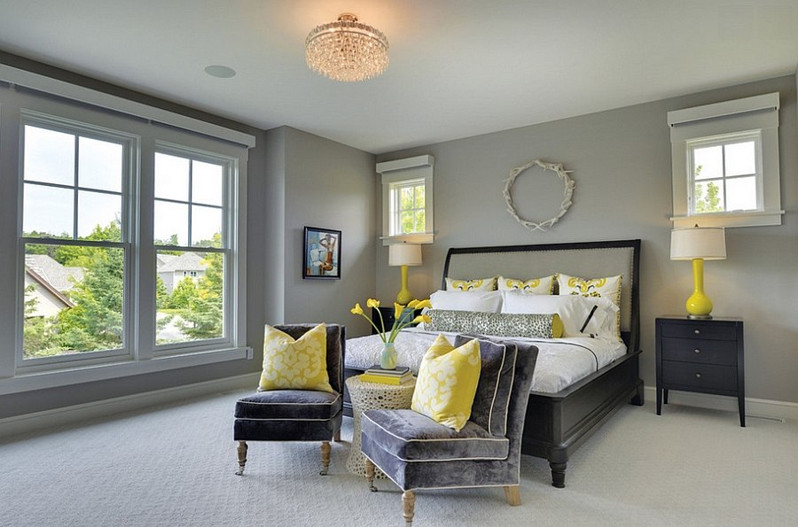
The 2021 color of the year is just out! And it’s not one, but two hues, for a change.
Pantone, the international authority on color trends, has announced the very neutral “Ultimate Gray” and a sunny yellow hue dubbed “Illuminating” as the colors that will make a splash and come to dominate the new year.
Ultimate Gray is meant to evoke “solid and dependable elements, which are everlasting and provide a firm foundation,” something we could likely all use after a tumultuous 2020.
Illuminating, on the other hand, looks ahead. It’s “a bright and cheerful yellow sparkling with vivacity, a warming yellow shade imbued with solar power,” says Pantone.
The choice of a grayscale color marks the first time Pantone has made an “achromatic” pick. However, it’s not the first time the company has crowned two colors. In 2016, Pantone broke the mold and named Rose Quartz, a soft pink, and Serenity, a pale blue.
Pantone predicts its Color of the Year will turn up in all sorts of ways in our daily lives over the next twelve months, from fashion and beauty items to home decor, product packaging and even food.
As a luxury developer, Hiranandani Communities keenly watches globals trends in colors, architecture, decor, furniture and much else to offer the finest in lifestyle and trends at its celebrated townships. You are most likely to see shades of these trending colors get reflected at their developments in subtle ways.
Indeed, the two independent colors highlight how different elements come together to support one another and best express the mood for Pantone Color of the Year 2021.
Classic Blue was the Pantone Color of 2020. It was eerily predictive of where 2020 was heading. Announced weeks before the first Covid-19 cluster was discovered, it is a shade used for medical scrubs around the globe. Classic Blue was meant to recall the serene hue of the sky at dusk, and reflect qualities like simplicity and stability, which the forecasters noted were greatly needed at the time. Of course, when they made their announcement in December 2019 they couldn’t have known what the next twelve months would hold.
2019’s Color of the Year, Living Coral, was a vibrant orange that Pantone said at the time, “embodies our need for optimism.” In 2018, they chose “dramatic and provocative” Ultra Violet and in 2017, it was “fresh and zesty” Greenery.
For sure, color has the power to impact a lot more than just the visual side of our lives, it is, in the words of Laurie Pressman, vice president of the Pantone Color Institute, “a way to express and affect ideas and emotions”.
Each year’s color is decided through a long and thoughtful process that takes into consideration lifestyle and industry trends, said Pressman. “Typically, trends that we see in color are reflecting big macro trends that are taking place in culture,” she added.
Color influences can come from art, upcoming media, movies, lifestyles, socioeconomic and political conditions, travel destinations, new technology — really anything.
As consumers continue to look for ways to overcome the uncertainties stemming from COVID-19, the colors “satisfy our quest for vitality.”
The colors of 2021 symbolize both strength and positivity that captures the promise of something “sunny and friendly’.

